Published on 02/12/2018
How I make page previews and which part of the page ends up being a preview.
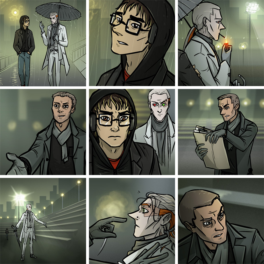
As I mentioned in page creating process post, I make pages in high resolution with ton of layers, including word balloons, text for both languages, and panel borders. This is why a picture on my previews is usually slightly bigger than corresponding part of published page and has no balloons on it: I copy it from hi-res file with service layers switched off.
These days I need two type of previews: horizontal for embed link on vk and for twitter (since it crops everything) and square for everywhere else. I have template files for both of them, and as you've probably seen, the square one has some additional layers: N-16's cityscape mask (I change it for every scene) and some text (again, it's decoration changes with every scene). It's a small thing, but I like the design of my square preview and these tiny details make all the difference.
Anyway. Now about the panel choice. Lately it's not that obvious, as I try to avoid spoilers. For example, a preview for a page with Semeon reveal (2.5.20) shows only Max Graft with a file and not Semeon. And the one where Max attacks Yarr (2.5.22) nothing tells about it.
However, for most of the pages, where there is no sudden reveals or action, the choice is usually easier. I prefer to use big enough panel, either close-up of a character or medium range shot where we can see some faces, with less detailed background (so it doesn't steal the attention), and not too vertical, so I could crop a square picture. And it should look good enough, though I try to make all my panels look decent, so it's not a problem.
Meanwhile we're almost done with chapter 5 and it's muddy green-ish palette, and I will not miss it.