Published on 08/20/2017
Wall of text where I describe in details the process of creating Noosphere pages (with pages 2.5.9 and 2.5.10 as an example).
To create a comic page, you can't just sit down and draw. There are many nesessary steps to do before and after drawing itself. In this text I'll show what exactly I do to create Noosphere pages.
Tools and programs I use:
— Adobe Photoshop CS5.1 for layouts, coloring, lettering and pretty much everything;
— Clip Studio Paint Pro (Manga Studio) for sketches and inks;
— Wacom Intuos 5 touch M graphic tablet;
— and various analog tools like pens and notepads for scripts, thumbnails and notes.
I can't show the analog part of prep work, so straight to digital.
1. Page Template
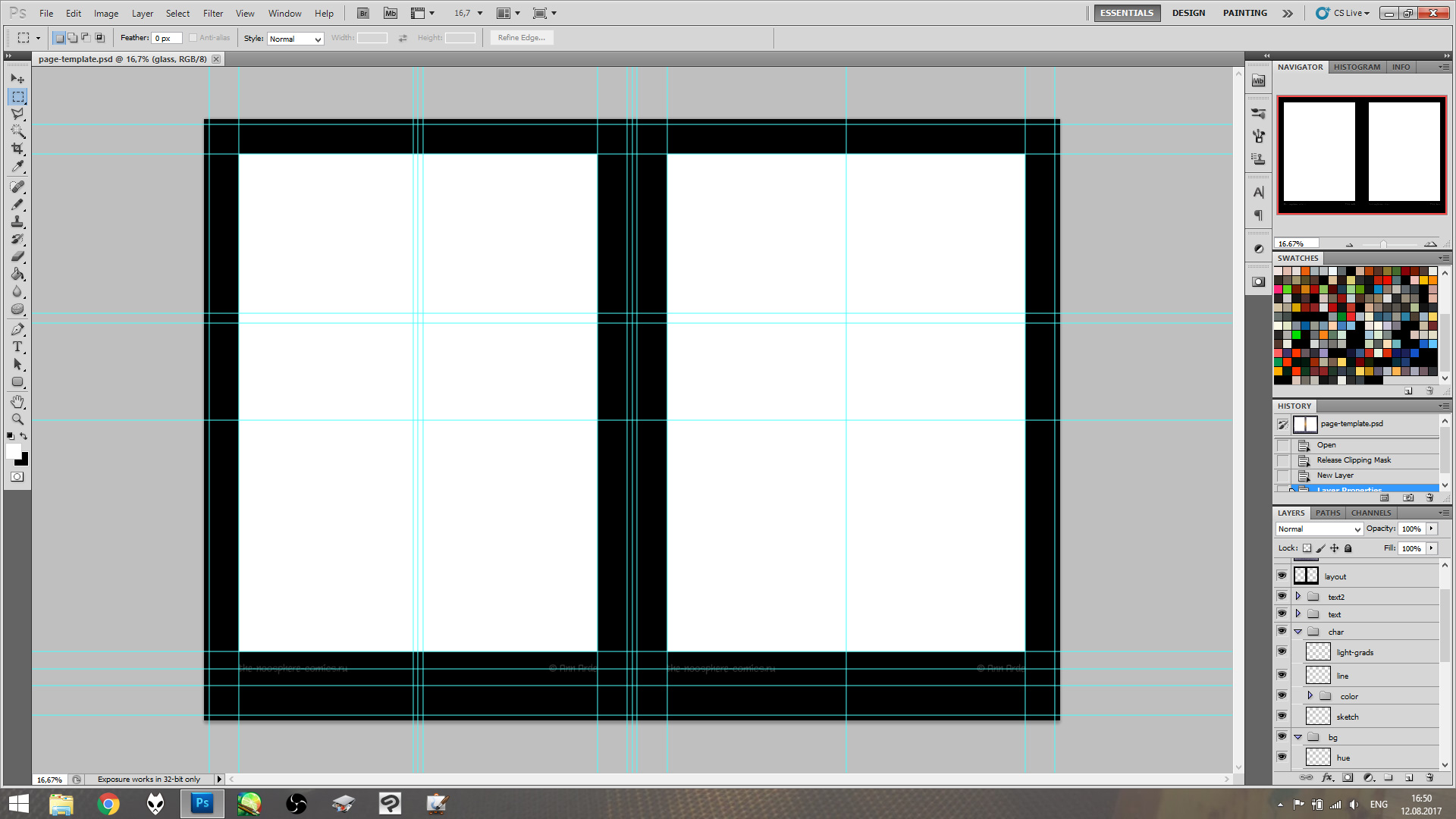
To save time on page setup, I created a template: an empty double-page spread with all required layer groups (background, foreground, characters, text folders) and guides. With each scene I slightly change this template: usually it concerns shadow layers opacity, color overlays opacity and so on.
2. Page Layout and Text
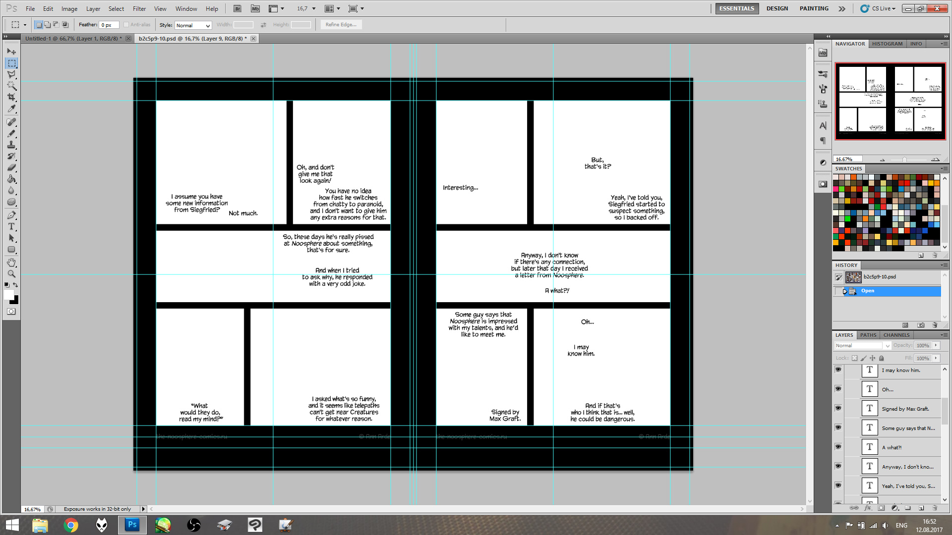
I have preliminary layout in my thumbnails, and at this stage I try to fit the dialogs into it and correct panel sizes or text length if needed. I align all horizontal borders (my OCD won't allow otherwise) and margins between borders and text if certain bubbles should touch the borders. Everything should be aligned and perfect.
After this prep work is done, I jump to Clip Studio to get to drawing part ('cause Photoshop is terrible for drawing, at least mine is).
3. Sketch: Rough and Detailed
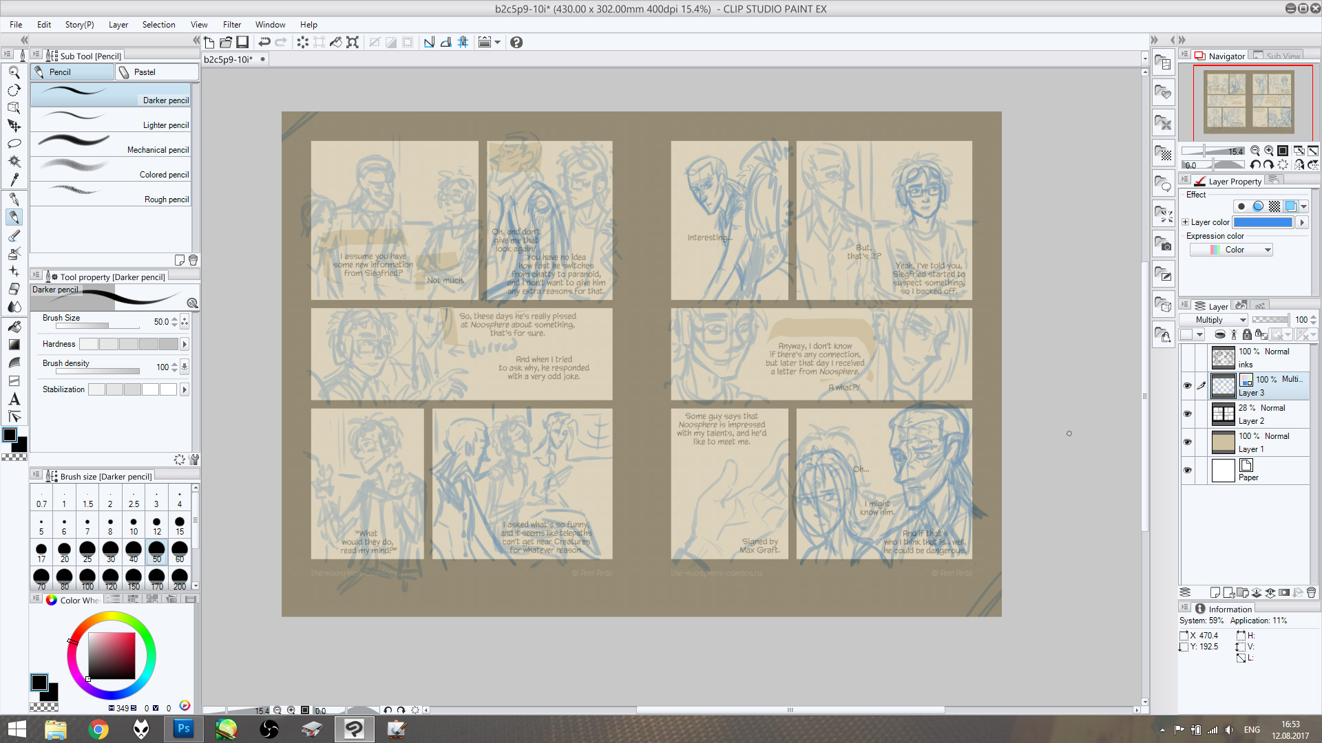
Usually I use two layers of sketch: rough outline to establish a composition and detailed sketch as a guideline for inking. On a pic above these two layers are already merged but usually it's blue for rough and red for detailed.
For this stage and for inking I create temporary background filled with some warm color (like beige) instead of default white — it reduces eye strain. Because, you know, drawing on white bg, especially at night, could be really hurtful for your eyes.
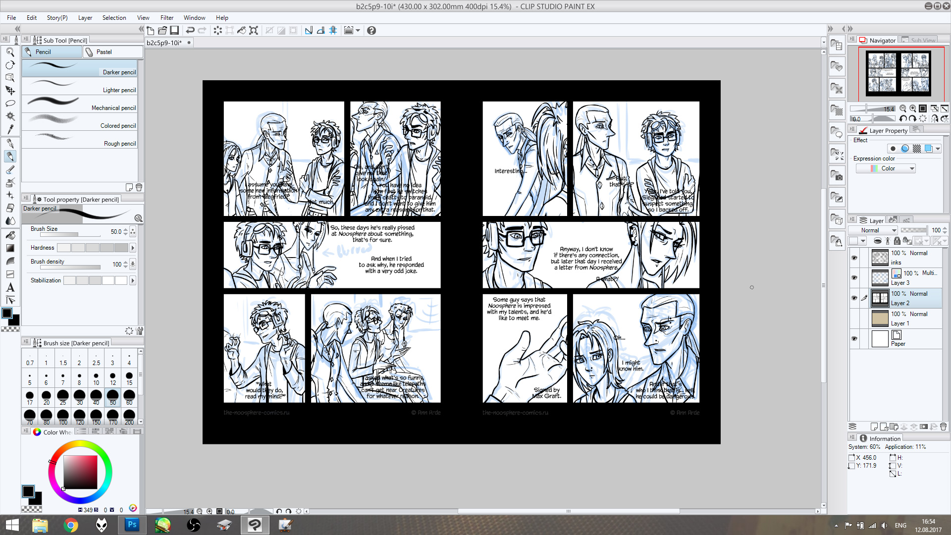
4. Inks
This one is pretty obvious: grab a G-Pen tool and trace. I draw contours on warm bg as well, don't mind white on a pic above.
After linework is done, I go back to Photoshop to start coloring.
5. Flats
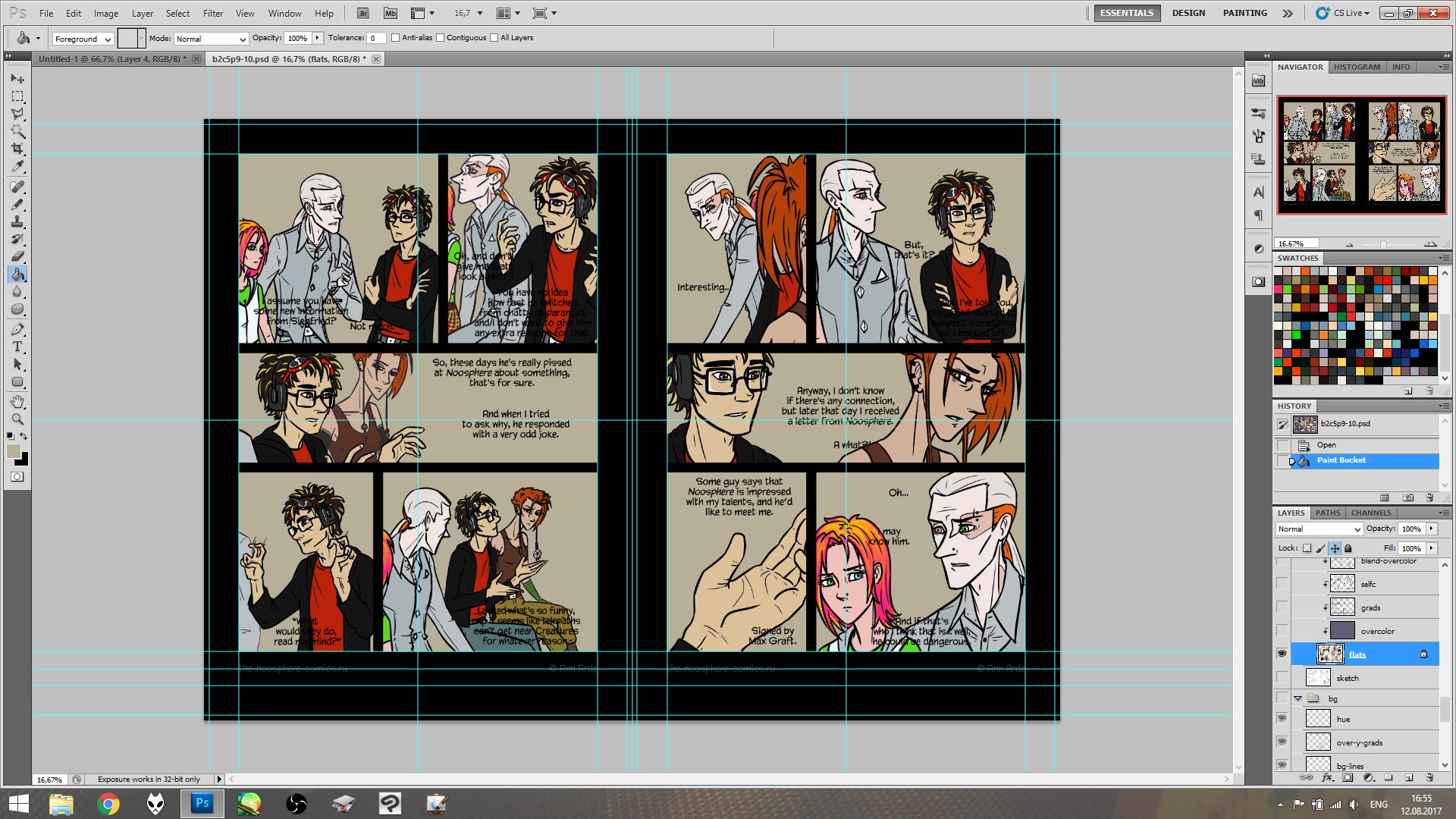
Flatting is a first stage of coloring. I made the palette with all local colors for my characters and scenes, and here I fill corresponding areas with those colors (for example, Kostya's skin color or Jule's t-shirt, etc.). Later on these colors will be affected by certain scene's palette, but at this point we see the characters in sort-of average white light.
6. Backgrounds
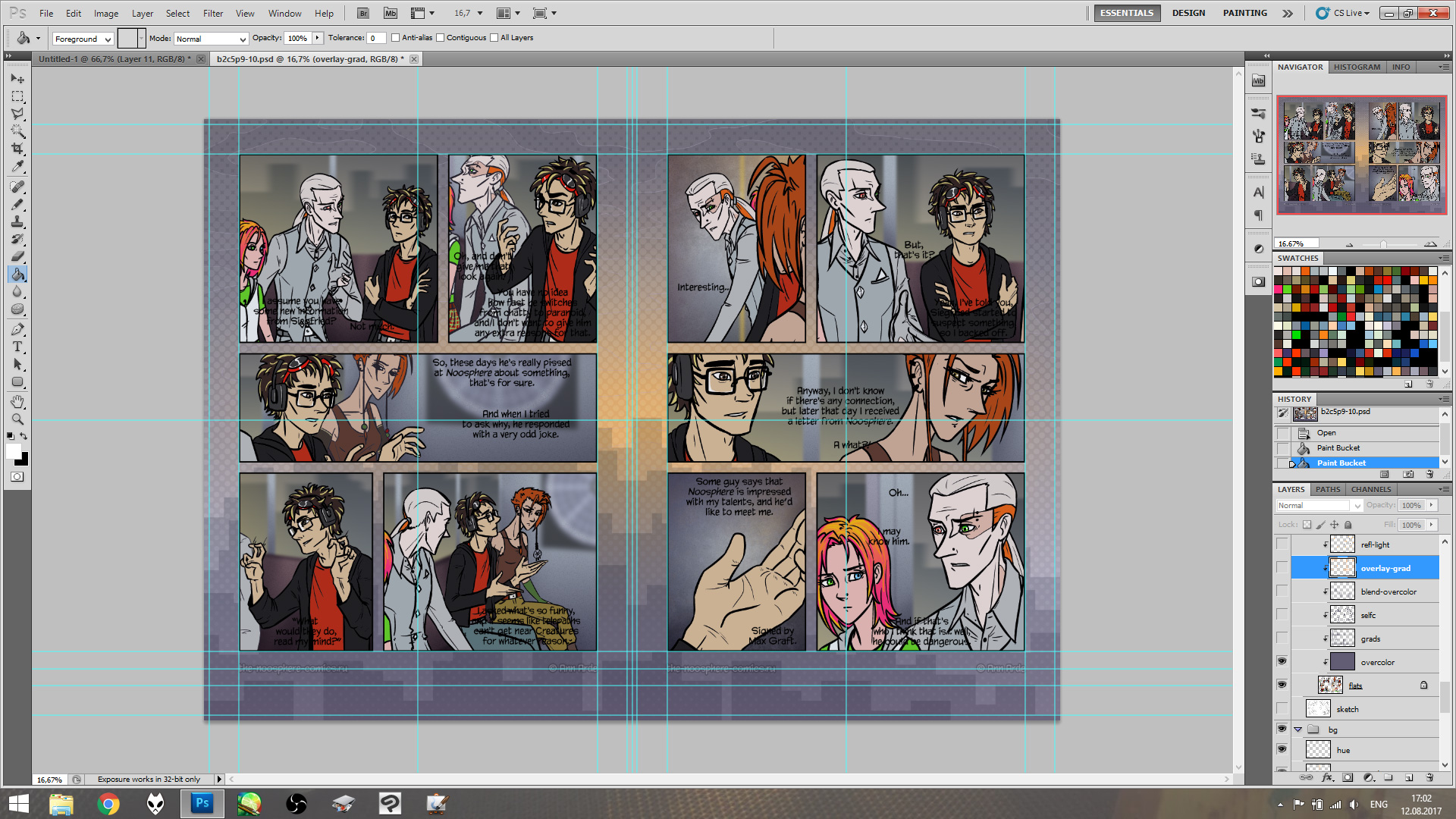
I can't show all the steps for this stage since I don't do them in any distinctive order. On the pic above most of the bg layers are already merged. This stage is like a chore to me, though I enjoy it's result most of the time.
I start with gradients for the sky (in those panels where it's visible) and building shapes. Then flats for background elements like walls, floors, etc., then flat and gradient shadows, overlay or color dodge for light, then blur if needed and then add noise to give the backgrounds some texture.
For each new scene I make a sort-of wallpaper with certain palette depicting N-16's skyline and current weather. This wallpaper goes on page borders (instead of plain black, as you can see above), and I use it's color scheme as a guide while coloring backgrounds.
7. Cel-shading
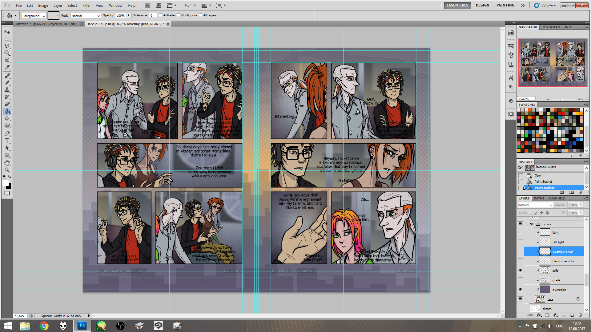
This one is easy: I add shadows on characters, usually one layer of flat color on multiply, sometimes two if the characters themselves are in the shadow — second layer helpes to add some volume.
8. Gradient shadows
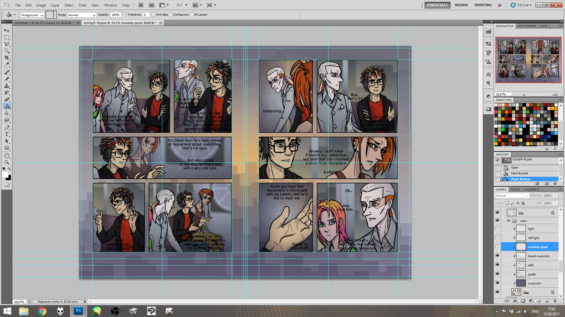
Also an easy one. I use gradient shadows to show where the lights come from and to separate important parts of the panel (say, faces and hands) from less important (for example, if one person is speaking and the other isn't).
9. Light and reflected light
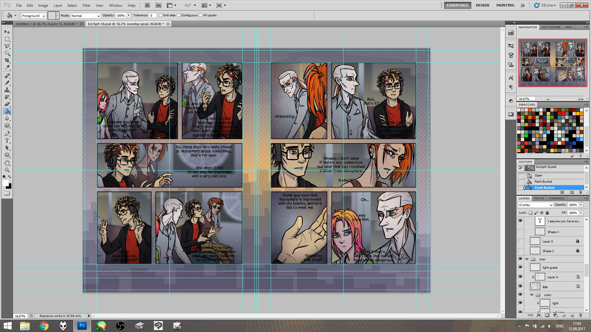
I use this stage to outline the contours (makes them more crispy on finished page) with some imitation of reflected light. I don't need photorealistic picture here, so all of the reflexes in the scene are the same color: both for speed and for consistency.
I also use gradients to lighten up certain, most important parts of the panel.
By the way, here is a video where I color backgrounds and characters (steps 6 to 9) in a pharmacy scene in Chapter 3.
10. Word bubbles and translation
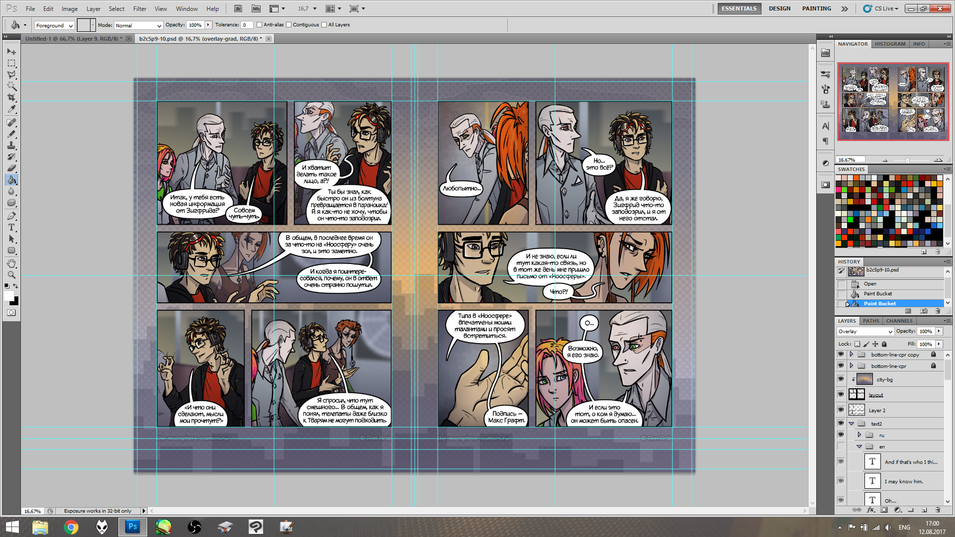
Despite the fact that I'm a native Russian speaker, I write the script in English and only translate it in Russian at this point. Sometimes it causes problems since Russian words and phrases are usually longer and might not fit into bubble. In this case I draw separate bubbles for English and Russian version.
For word balloons I use a transformed ellipse. I tried drawing them by hand, can't say it was easy or the results were any good. These days I slap an ellipse, transform it with Warp Transformation to make it more oval and slightly asymmetric and then draw a tail, usually with lasso.
After balloons are done, I add thin black borders to balloons and panels. Seems like that's it? Nope.
No more pictures, but the work isn't done just yet. Now I need to export my pages for web. Left and right separately, English and Russian separately, resized from 400dpi A4 to 900+px width.
Then I need to make preview pics: choose the right panel, hide all balloons, crop what I need and export to my previews file. Then — backups. And then, when the time comes, I need to publish the page on all those platforms I use. On some of those there are barely ten readers, on some — about 500, oh well.
And now it's done.
